A behind-the-scenes look at logo designs that didn’t work.

During the logo design process, I create lots of options that may look great but aren’t ultimately selected by the client. Maybe it’s because another option better suits their needs, maybe they want to go in a completely different direction, or maybe these just didn’t connect with the client. In the end, there can be only one, so the unselected options never see light of day. I pulled these out to show you some of the failures that were left behind.

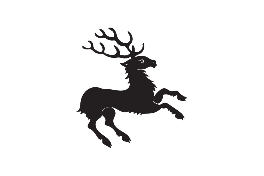
Failure is feedback — ultimately, all of these clients ended up with a logo that better met their needs. Failing fast and failing early helps me get to the best design solution, but sometimes nice work gets cut in the process.

