Websites & Apps are software-enabled digital products, and designing them well requires research, technical knowledge, and planning to craft, validate, and iterate complex designs. As a multidisciplinary designer, I can elevate your website design or app from an aesthetic expression to a holistic, user-centered design solution.

Responsive Design
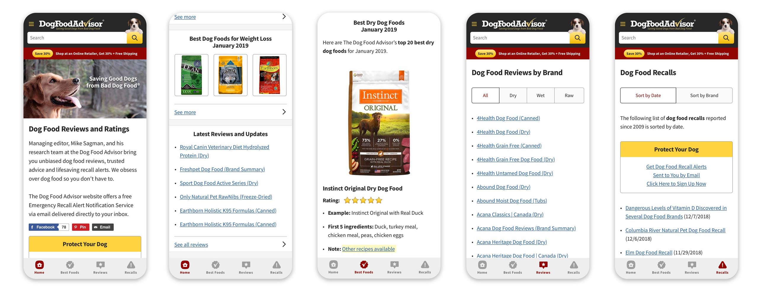
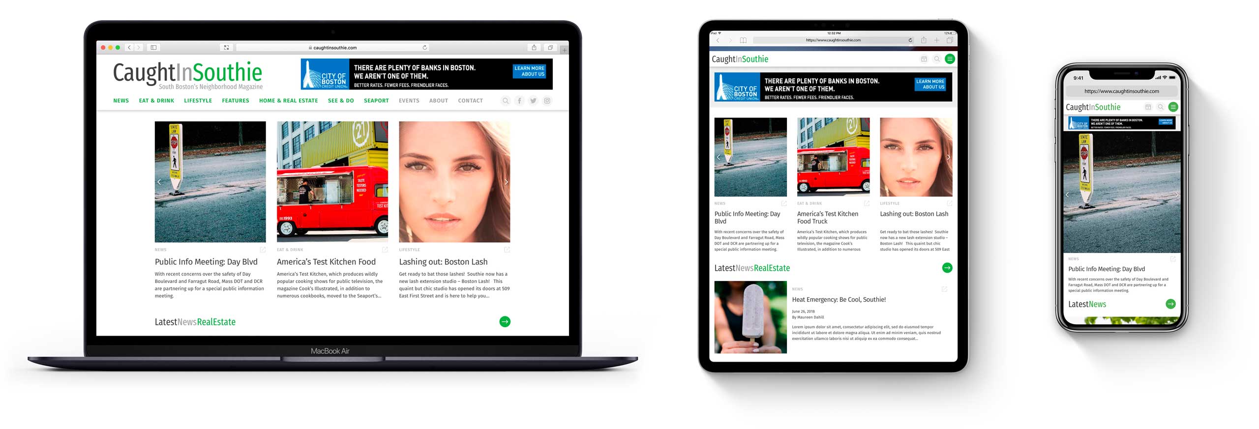
Responsive design uses fluid grids, flexible images, and media queries to allow the creation of web pages that adapt to any browser viewport so your site works well on any device—mobile, tablet, laptop, or desktop—regardless of screen size. More than just device breakpoints, responsive design allows headers and footer, menus, page content, images, type size, and even layout to resize and adjust as screens get larger or smaller. Rather than changing the HTML or the DOM, responsive design uses CSS to resize, reorder, and show/hide page content.

With responsive design, you can deploy a single codebase that works with any device, eliminating the need for a separate mobile-specific m-dot website. Practically every website I’ve designed since 2013 has been a responsive design.
Mobile-First Design
Mobile isn’t just a consideration anymore; it’s the primary way people use the web today. Worldwide mobile traffic has already surpassed desktop. Google has now made mobile-first indexing the default for all new domains. For many consumer-facing sites, we’re seeing 60-80% of our client’s traffic coming from mobile—and when we see data like that, we go mobile-first.
Unlike responsive design, Mobile-First Design is a design process rather than a technology solution (well mostly, anyways). In fact, mobile-first is responsive design, but flipped upside down.
Traditionally, websites were designed for desktop-only. Once the industry started using responsive design, sites were still being designed desktop-first, meaning we squeezed things onto mobile and lost features and capabilities (called graceful degradation) as browser sizes and capabilities decreased.
With mobile-first design, we start on mobile to ensure the experience is great where the majority of users are at. From there, we use responsive design technology to add features and expand layouts (called progressive enhancement) as browser sizes and capabilities increase.
Mobile-first design is difficult because it requires fearless content editing and doing things differently than you’re accustomed to, but my experience will guide you through the process.
Native Mobile Apps
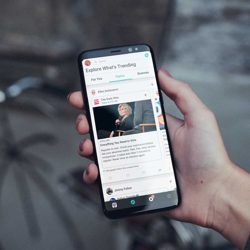
Native Mobile Apps on iOS and Android have many advantages over the typical website—they can offer richer interactivity, deeper device-specific feature integration, access to native in-app purchasing, and discoverability and monetization through the Apple App Store and Google Play Store.
Naturally, there are disadvantages to native mobile apps as well, at least for those coming from the website world. For one, apps usually require a far greater level of effort to design and develop than a typical website, so costs are higher and timelines longer. If you’re coming from an SEO-driven high traffic website world, you’ll likely find App Store discoverability lackluster in comparison (at least until you learn and understand App Store benefits). And of course, the cut Apple and Google takes may shock you.
Having said that, for many digital products, native mobile apps (or hybrid web-powered native mobile apps) make the most sense. As someone who’s been designing native mobile apps for several years, I can tell you that I honestly love doing them—but as a consultant, I’ll be the first to tell you if it doesn’t make sense for your situation.
Progressive Web Apps
Somewhere between native mobile apps and mobile first responsive design websites is the new kid on the block: a Progressive Web App, or PWA for short (well, there’s nothing particularly new about the technology itself, but the thinking, packaging, and naming conventions are new).
The best way I can describe a Progressive Web App is “an app-like website.“
PWAs are responsive websites that are installable like an app, but can also be used as a traditional website in a browser if a user chooses not to install it. By “installable” I mean a user can add the app to their phone’s home screen like any other app, and once there they will see it as a full-screen app without having to go to their web browser, or even see the web browser in the app itself. To a user, it will (mostly) look and act like a native app.
Like native apps, PWAs can send notifications, access data from the web, access (some) device hardware, and display content offline if a user doesn’t have a connection. Unlike native apps, they’re discoverable on the web, not just the App Store, meaning you can link to them, and SEO will work just fine.
As much as I love native mobile apps, for many clients, a PWA will be the right solution. They’re cheaper, faster, always up-to-date, benefit from SEO, and still provide an app-like experience.
As a consultant, I’ll guide you to the solution that fits your needs best.

Get my FREE eBook: Understanding Digital Products
Need help understanding websites, web apps, hybrid apps, native apps and why you might choose one over another?
Learn More
Strategy in Expertise
User Experience (UX) in Expertise
User Interface (UI) in Expertise
Consulting in Services
Branding & Logo Design in Services
Website & App Design in Services (You are here)