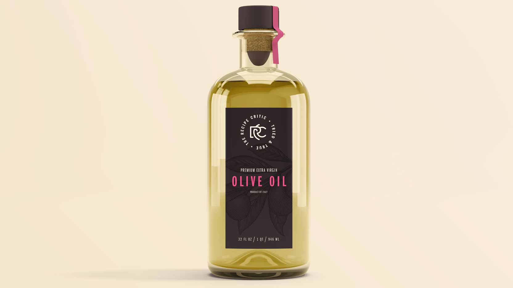
The Recipe Critic is a popular food blog with 8+ million monthly site visits and nearly 5 million followers on social media. After our team designed and developed her new website, Alyssa asked me to create a new branding & logo design that would allow her to expand her online presence into physical products. The new logo needed to be professional rather than cutesy—something her industry is overrun with—and be reminiscent of a back stamp on dinnerware.
To account for a variety of possible uses, the new logo needed to:
- work independently of the wordmark
- work with and without the tagline
- work in 1-color and 2+ colors
- locksups in horizontal, vertical, and circular orientations
- usage guideline documentation to ensure consistent use
The following are images from my branding presentation: